Are fonts ruining your creative content?
As much as fonts can be super cool and add character to your content, they can also cause some damage. Here’s a few tips on how to select fonts that increase engagement.
The fonts have gotten a little bit out of control.
Everybody’s using different things. Adobe’s come out. There’s a million fonts. It’s a little overwhelming on what you should and shouldn’t be using on your posts and your copy for LinkedIn & YouTube. All the different things; your title sequences for your articles, for the graphics that you’re putting on posters, like it’s a
thing.
Typography is kind of a big deal.
So I’m reading this book by Ogilvy which is old school. Got some great points on the things to consider for typography for the content that you’re creating.
So first is the goal of typography, which I never really thought about. The goal is to get people to read your content. That’s the goal of typography. Bad typography makes people not want to read your stuff.
Just because you think all the little curvy lines and flourishes in that particular font are awesome; if somebody sees that and thinks, like I’m not doing that – you’ve just wasted your time.
So if the goal of typography is to get as many people as possible to read your content, then your font selection and the way that you use it should be with that in mind. Something easily readable.
I always thought when I saw capital letters that the person is actually yelling at me which is already a turn off, but even back then before you know texting was a thing, Ogilvy says that capital letters were a horrible thing because they actually interfere with the way that your eyes scan over the words. With lower case words your eyes will naturally scan over them and read them faster, but if we put them in all capitals your brain naturally goes to actually looking at each letter and putting the words back together, which I didn’t know.
But he says if you capitalize all your letters it will wear the audience’s eyes out faster and then they won’t want to read anymore. So the point is don’t use capital letters.
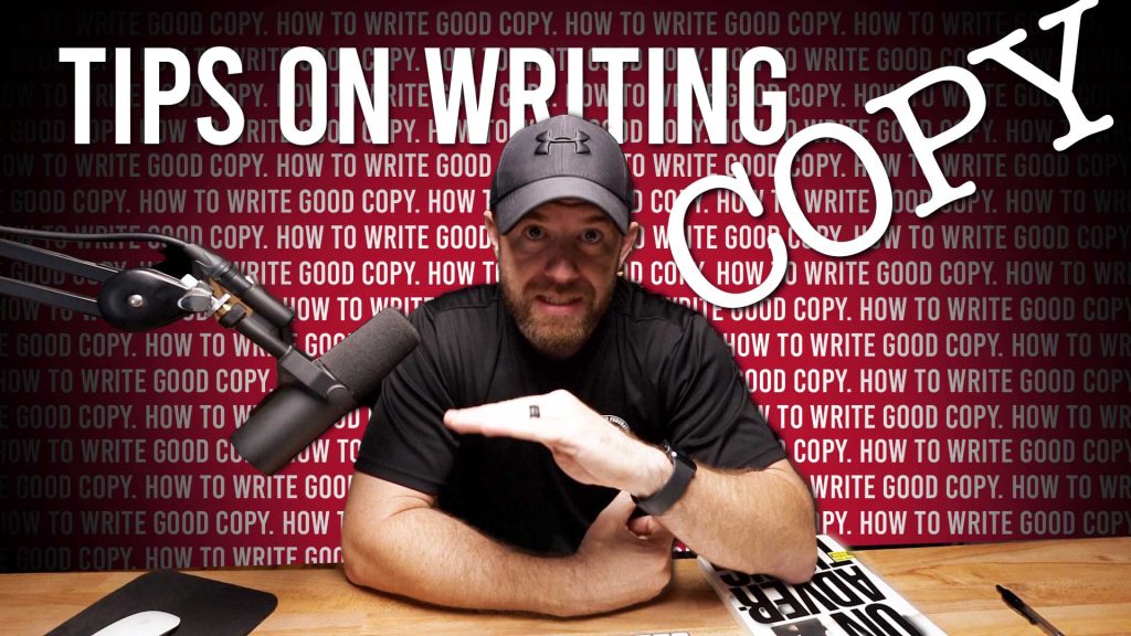
Avoid superimposing your typography over images because it just makes it confusing. You can’t scan it as fast. So if you can at least separate; put your image here and then you’re type there or there or there, it’s just not over the top of it because again, you’re trying to get them to read it. Putting text over an image makes it hard to do that.
Don’t use a period at the end of a headline. It looks weird and it makes the audience think you’re done. They can move on to the next thing, so don’t put on a period, that way they get to the end of that and think ‘ah I should keep reading it because there’s no period.’
If you’re doing long copy Sans serif can be cool and look kind of cool but it is harder to read than normal Serif. It just is. Serif helps your eye pick up all the little flourishes on each of the letters and you can scan and read faster that way. If you’ve got longer copy; there’s a reason why a lot of books and novels have serif copy.
White type on a black background usually not good unless you’re writing like something on a newspaper and since barely anybody reads newspapers anymore, and I don’t even know where you can buy one now, you should probably just avoid it. Black type on a white background is always the best.
Five point font is too small. Fourteen point font is too big. For some reason we’ve all gotten
used to eleven point font. It just looks right. It’s the right size. You don’t have to like hold it way out there to see it. You don’t have to zoom in real close and get your face right up on it. Eleven point font is ideal.
I know growing up, I’m pretty sure that our teacher’s made us use twelve point but that’s when we were trying to make the papers last longer. I don’t know. That was the whole thing.
If you add a line spacing between your paragraphs people will like your content more. It’s just true. In fact it increases readership by 12% which is huge. So add a little space there because
you’ll be happy you did.
Finally one of the best things that I thought Ogilvy discusses was that was nobody buys things because the font in your article was helvetica. That being said, does an article or an ad work if nobody reads it?
Ogilvy says you can’t save souls from an empty church.
Remember, the goal of typography is to get people to engage with your content, so best case scenario, keep it simple. Serif font. Right size. Put some space after your paragraphs. You’re
gonna be good.
That’s It. I’m out.


